We’ve left it open for you, so you don’t even need one of those little keys. Because writing is life, and keeping it real means forgoing the line between the personal and the professional.
The BA Band: Molly Regan

Madison Utley speaks to Book Architecture’s favorite graphic designer, Molly Regan, about how she expanded into book design, the process of creating the cover for Stuart’s second and third books on writing, and the best and most challenging parts of working with authors.
Q: Talk to me about what it is you do/the scope of your services within the book sphere.
A: My main jam is logos and branding, but I also do a lot with brochures, posters, packaging, and signage. Stuart was my gateway to book cover design, which was something I’d always wanted to try. When I first did a cover for one of his clients, I realized it was really just poster design, but on a smaller scale. It can be hard to make a cover compelling enough that people pick the book up, while keeping all of the info legible, especially if there’s a big title and/or longer subtitle, but I’ve found I really enjoy the challenge of a tinier canvas.
I also expanded into interior graphics for books. Trying to make charts and graphs interesting can be really fun. I especially like infographics. Right now, I’m actually working on some “loose illustrations” for a glossary of terms, and I will admit it’s challenging! I’m not really an illustrator, but it feels good to exercise different creative muscles.


Q: How did you first get connected to Stuart?
A: Alright, well, this is a little embarrassing. I had an old college project/poster listed on Craigslist, that I really thought someone would buy only for the frame. The poster featured some 1950s Olivetti typewriter ad graphics, which is how Stuart came across the listing as he’s a big typewriter collector. Anyway, he ended up buying it! And, some time after that, he contacted me to do a book cover… Craiglist unites!
Q: Tell me about the process of creating the covers for Stuart’s second and third book.
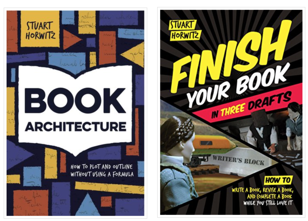
A: They were both super fun projects. Stuart’s second book was my introduction to the Book Architecture method – the series, grids, rearranging scenes, etc. In our meeting, I remember him saying he was imagining something Mondrian-esque, which really complemented the grid process outlined in the book. It came together pretty organically; just playing with forms, sort of ‘painting’ in shapes. We both felt good about the cover we came up with. It’s geometric, but also lively.
For his third book, my initial designs were too tame and not the vibe Stuart was going for. With his input, I turned towards more of a comic-book style – which provided a good framework for featuring stills from the stop-motion videos that were released in tandem with the written book (!). It was the right look for the tone of this book, and definitely more fun.

Q: How do you go about figuring out a client’s vision and getting it down onto the page?
A: When a client comes to me with a clear idea that they’re already set on, I accept that brainstorming is off the table and instead focus on making a good design out of what it is they want. When they’re more open, I’ll shoot around ideas of what I think they might want or need and, if they connect with something, I’ll run with it. It’s always fun when a word or doodle I come up with during a meeting or from the notes I keep becomes the driving force of a project.
Q: How does the process change when working with a hard-to-please client?
A: It is sort of heartbreaking when you present a good idea and the client passes, especially when their reasoning is unclear. It’s rare, but there are times when you have to let go of any creative input and instead simply become the facilitator of your client’s vision. I think of those projects as ‘work-work’ and not fun work. That kind of work will definitely never see the light of day in my portfolio, and that’s okay.

Leave a Reply